Design Principles and Layout Architecture for Dashboards
Design Principles and Layout Architecture for Dashboards
An executive dashboard is not merely a collection of charts thrown onto a sheet. It is a visual decision-support tool that communicates key performance indicators (KPIs) with clarity, hierarchy, and precision. Designing professional dashboards requires adhering to proven UI/UX principles, structured grid systems, and thoughtful color theory.
1. The F-Pattern Reading Flow & Visual Hierarchy
Eye-tracking studies demonstrate that business decision-makers read executive screens in an "F-Pattern" (scanning across the top header, dropping down, scanning across again, and skimming down the left):
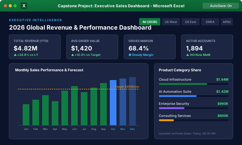 Click to Zoom
2. Professional Formatting & Decluttering Rules
To elevate your spreadsheets from amateur workbooks to executive applications:
- Hide Gridlines & Headers: Go to View tab and uncheck Gridlines and Headings. A crisp, plain background instantly gives your sheet a modern software feel.
- The "One-Screen Rule": An executive dashboard should fit entirely on a standard display (1920x1080) without requiring horizontal or vertical scrolling.
- Intentional Color Palettes (The 60-30-10 Rule):
- 60% Dominant Neutral: Crisp white canvas or soft light gray ('#F8F9FA').
- 30% Secondary Structure: Deep slate or navy blue for card headers, titles, and borders.
- 10% High-Contrast Accent: Vibrant emerald green for positive metrics or crimson red for critical alerts. Never use 10 different colors across charts!
3. The 3-Layer Spreadsheet Architecture
Never mix raw data, calculation formulas, and final visualizations on the same worksheet. Professional financial modelers structure their files into three distinct layers:
- 1Layer 1: Raw Data Tabs ('Data_Sales', 'Data_Customers'): Pristine tables imported via Power Query; hidden from everyday viewers.
- 2Layer 2: Calculation / Staging Tabs ('Calc_Pivots', 'Calc_Lookups'): Where Pivot Tables, helper formulas, and lookup grids reside.
- 3Layer 3: The Presentation Dashboard Tab ('Executive_Dashboard'): The sole customer-facing sheet containing only KPI cards, interactive slicers, and polished charts!
Multiple Choice Questions
1. Why should you uncheck 'Gridlines' and 'Headings' on an executive presentation dashboard?
A. To save ink when printing B. It eliminates visual clutter and creates a clean, application-like software appearance C. Gridlines cause Excel to crash D. Headings disable formulas Answer: B Explanation: Turning off sheet gridlines and row/column headings removes spreadsheet noise, transforming the sheet into a clean UI canvas.
2. In executive dashboard design, where should high-level summary KPI cards be positioned?
A. At the very bottom right B. Across the upper quadrant directly below the header/slicers, adhering to natural F-pattern scanning C. Hidden on a secret tab D. Scattered randomly across charts Answer: B Explanation: Executive users read in an F-pattern; positioning primary KPI indicators at the top provides immediate situational awareness.
3. What is the '3-Layer Architecture' in enterprise spreadsheet modeling?
A. Formatting cells with three borders B. Separating the model cleanly into Raw Data, Calculations/Pivots, and Presentation Dashboard tabs C. Using three different fonts D. Saving the file in three cloud folders Answer: B Explanation: Three-layer architecture enforces data hygiene by separating raw inputs, calculation staging engines, and the user-facing presentation dashboard.
4. What is the 'One-Screen Rule' in professional dashboard design?
A. You can only look at the monitor with one eye B. The entire executive dashboard should fit within a single screen view without requiring the user to scroll C. Only one computer can open the file D. The file can only have one sheet Answer: B Explanation: The One-Screen rule ensures that all critical metrics are visible simultaneously without requiring vertical or horizontal scrolling.
5. According to the 60-30-10 color rule, what role does the 10% accent color serve?
A. Background fills B. Table row striping C. Drawing focused attention to key alerts, positive gains, or critical callouts D. Font color for row numbers Answer: C Explanation: The 10% accent color is reserved for strategic highlights, positive/negative callouts, and primary focal points.
Building Dynamic KPI Summary Cards
Continue learning with hands-on practice, examples, and exercises in the upcoming topic.
Related Lessons
| Previous Lesson | Next Lesson |
|---|---|
| Introduction to VBA Editor & Writing Simple Automation Codes | Building Dynamic KPI Summary Cards |
Practice Quiz
Test your understanding of this lesson with 5 questions. Each question has one correct answer.