Building a Full Interactive Sales & Revenue Dashboard
Building a Full Interactive Sales & Revenue Dashboard
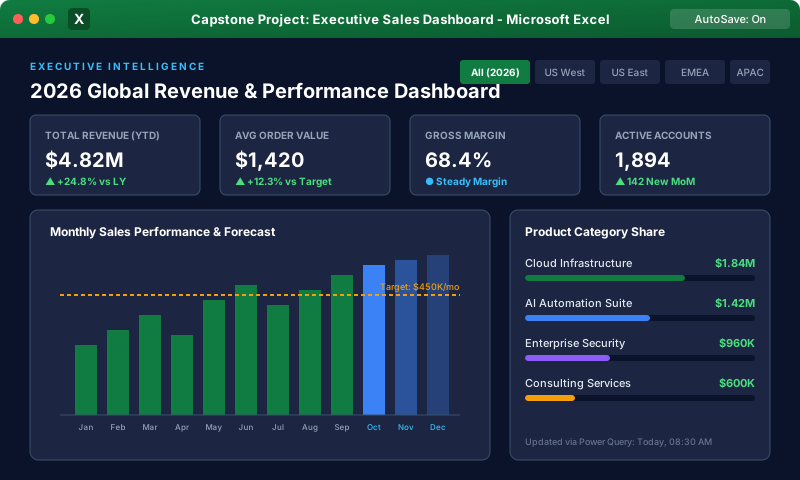
In this milestone lesson, we synthesize all advanced modeling and visual techniques into a cohesive, production-grade Executive Sales & Revenue Dashboard. We assemble the canvas, format KPI metric cards, construct interactive combo charts, format tabular rankings, and polish the user interface.
1. Project Specifications & Blueprint
Our executive sales dashboard consolidates $15M in multi-regional transactions:
- Header Band: Logo, Title ("Enterprise Sales Performance Dashboard"), Reset Button, and 3-Column Slicers (Year, Region, Channel).
- KPI Row: 4 Rounded KPI Cards (Gross Revenue, Total Orders, Average Order Value, Margin %).
- Main Visual (Center Left): Dual-Axis Combo Chart (Monthly Revenue as Columns; Target Line as Line).
- Product Breakdown (Center Right): 100% Stacked Bar Chart illustrating category sales distribution.
- Top 10 Performers (Bottom): Tabular leaderboard with Data Bars showing top sales representatives.
 Click to Zoom
2. Step-by-Step Construction Flow
Phase 1: Canvas Preparation
- 1Create tab Dashboard.
- 2Select all cells (Ctrl + A) > Fill background with crisp off-white (
#F4F6F9). - 3Turn off Gridlines and Headings on the View tab.
- 4Set column A width to 2 (acts as a clean left margin spacer).
Phase 2: Building the Staging Calculation Models
- 1On Calc_Pivots, build:
- PT_KPIs: Calculates Total Sales, Total Quantity, AOV, Gross Margin %.
- PT_MonthlyTrend: Month in Rows; Revenue and Target in Values.
- PT_TopRep: Sales Rep in Rows; Sum of Sales in Values; Value Filter set to Top 10.
Phase 3: Placing and Binding Visuals
- 1Draw 4 Rounded Rectangle KPI Cards across row 4. Link text boxes to 'Calc_Pivots'.
- 2Insert Combo Chart from 'PT_MonthlyTrend'. Format bars in Deep Slate Blue (
#1E293B) and the Target line in Bright Coral (#F43F5E). Remove gray field buttons. - 3Position Top 10 Table in bottom container. Apply Data Bars to the sales column (Conditional Formatting > Data Bars > Gradient Blue).
3. UI Polish & Usability Optimization
- Snap to Grid: When positioning charts and slicers, hold down the Alt key while dragging! This snaps the edges of shapes perfectly to underlying cell borders, ensuring alignment across all dashboard elements.
- Lock Dashboard Against Accidental Moving: Group related shapes together (Ctrl + Click > Shape Format > Group).
Multiple Choice Questions
1. What happens when you hold down the 'Alt' key while dragging or resizing a chart or shape on an Excel worksheet?
A. The shape rotates 45 degrees B. The shape's edges automatically snap precisely to the underlying worksheet grid cell borders C. The shape is duplicated D. The shape turns transparent Answer: B Explanation: Holding the Alt key activates Excel's 'Snap to Grid' feature, snapping graphic boundaries flush against cell borders for alignment.
2. Which background styling provides the cleanest, most modern aesthetic for an executive dashboard?
A. Bright neon yellow B. Crisp off-white / light slate (#F4F6F9) with sheet gridlines hidden C. Black with red borders D. Default harsh white with visible gridlines Answer: B Explanation: A soft off-white canvas paired with hidden gridlines creates a modern, distraction-free environment for dashboard cards and charts.
3. What is the role of the 'Calc_Pivots' sheet in professional three-layer dashboard design?
A. It is printed for customers B. It serves as an internal staging engine where Pivot Tables and helper formulas calculate safely out of executive sight C. It holds user passwords D. It records Excel macros Answer: B Explanation: Staging calculation sheets house the analytical engines, formulas, and Pivot Tables away from the clean presentation canvas.
4. How can you ensure that multiple graphic elements (such as an icon, a card shape, and a text box) stay together as a single unit?
A. Save as PDF B. Select all objects, right-click, and choose Group > Group C. Merge Cells D. Apply Data Validation Answer: B Explanation: Grouping graphic objects binds them into a single compound UI element that moves, resizes, and formats as one.
5. What chart combination is ideal for comparing actual monthly revenue against budgeted revenue targets?
A. Clustered Column (for Actual Revenue) and Line (for Budget Target) B. 3D Pie Chart C. Radar Chart D. Waterfall Chart Answer: A Explanation: Overlaying actual revenue as columns with a target line provides a clear visual comparison of goal attainment across time.
Protecting Worksheets, Specific Cell Ranges & Workbooks
Continue learning with hands-on practice, examples, and exercises in the upcoming topic.
Related Lessons
Practice Quiz
Test your understanding of this lesson with 5 questions. Each question has one correct answer.